
During our most recent product building cycle, we experimented with developing a Slack app for Marginal. As engineers who primarily work on Ruby on Rails applications, this gave us an opportunity to dive into an entirely new tech stack. The joy of discovery and learning something new was really refreshing. However, this exercise was not without its fair share of challenges and hurdles to overcome.
In part one of this series, we shared a few of these lessons. Here we'll cover the remaining items that we found most surprising or challenging about developing Slack applications.
Slack App Interactivity
Marginal helps teams host a weekly discussion about an article they read, a podcast they listened to, or a video they watched. Each participant records items they'd like to discuss with the team and the application presents these in a round-robin manner during the meeting, giving each individual an opportunity to direct the discussion.
The process of scheduling discussions, collecting participants' thoughts, and conducting the meeting are all highly interactive. Each new discussion requires information about the article, podcast, or video to be collected and for the team to be notified and reminded about the discussion. During the meeting each participant reviews the ideas they captured and selects one to present to the team. The application then displays this idea to all participants, along with a button to move on to the next presenter.
The set of user experiences (UXs) supported within a Slack app is quite constrained. A message can be sent to a channel/individual, the app can expose slash commands or shortcuts for users to invoke, and in some cases a modal can be launched for a single user. As a result, many applications maintain very simple interactions with their users (e.g. presenting static information, posting a message with 1-2 buttons that support a limited set of responses, etc). We were initially concerned that the highly interactive experience we envisioned for Marginal would be difficult to implement, if possible at all. However, this turned out to be an unfounded fear.
The set of user experiences supported within a Slack app is quite constrained, yet we discovered that implementing highly interactive experiences was surprisingly feasible.
Phoning Home (Just Like E.T.)
When an app posts a message containing interactive components (e.g. buttons, text input fields, dropdown lists, etc), modifying these elements immediately triggers a request to the application's backend service. The payload received by the application in these instances includes a response_url attribute (docs). By sending a POST request to this URL, the application can quickly and easily update the layout for the originating message (e.g. replacing the input field with a success message, showing then next set of form elements for the user to fill out, etc).
This allows the application to focus on detecting the action that was taken and the feedback that should be provided to the user about the results of this action. Notably this avoids the need for a lot of boilerplate logic related to looking up the ID and channel of the originating message, retrieving/generating/refreshing the authentication token for this request, or other similar operations that would be necessary without this nicely packaged URL.
For an application like Marginal that relies on numerous interactions, Slack's response mechanisms add up to significant savings in the overall complexity of the application.
A similar set of utilities are also provided for updating modals quickly and easily upon submission (docs). These mechanisms make it easy to efficiently support the back-and-forth interactions between users and applications that result in a delightful user experience. For an application like Marginal that relies on a large number of these types of interactions, this simplicity adds up to a significant savings in the overall complexity of the application.
Slack Messages ≠ Forms
While the ability to rerender messages and modals was surprisingly easy, there were other aspects of the UI for Slack apps that were more challenging than initially expected. Coming from a web development background, we unknowingly brought a set of assumptions about how state would be managed throughout the workflow of this application. Namely that backend service requests would be submitted upon completion of a form or modal.
Based on this assumption, we initially designed the discussion setup message in the same way we would if we were displaying it on a web page:
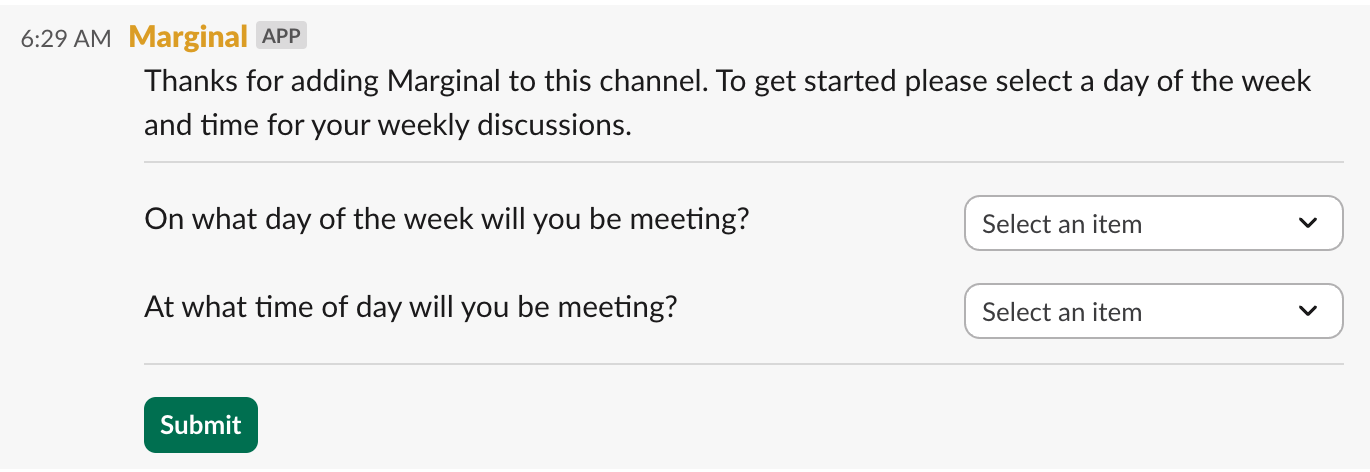
Experimenting with this form, we discovered that each interaction with a dropdown field is delivered to the app individually. This makes the "Submit" button completely unnecessary, and as a result we ended up dropping it entirely. Instead each dropdown field operates as an isolated mini-form. They are submitted to the backend service individually and upon success are replaced with a message informing the user that this value was collected.
However, collection of these values is just the first in a series of actions the user takes to configure the discussion series for their team. As a result, when both dropdowns are successfully submitted, the message needs to be entirely replaced with the next step in this workflow. The lack of a single submit operation for the entire form made this condition more challenging to detect.
Instead, we have to identify the current version of the message being displayed (i.e. what step in the flow is the user on) and explicitly check each field to verify that a complete and valid set of inputs have been provided. There is very little client side validation that can be done in these forms, so all of these input validation checks must be performed within the backend service. Only once all inputs are validly populated will the next form in the workflow be presented.
Developing for Slack requires a paradigm shift in how we think about UI state management—each interaction is submitted individually, creating both challenges and opportunities.
While the additional logic required for this very simple, two input form was minimal, this complexity grows exponentially as the information being collected and the length of the workflow grows. This is compounded further in applications that support many such workflows, as would be the case for Marginal.
Death By 1,000 Edge Cases
On top of this, the submission of each field to the app's backend service individually has implications on UX edge cases like the following:
- Partial Form Completion: It's possible for the form to be abandoned after some but not all inputs have been submitted. For forms that represent a required step for the application, the user will eventually need to be prompted to restart or continue this process. To support this, the partially complete state of the form either needs to be stored and the user needs to be prompted to provide only the remaining information or if the form is discarded, the original message collecting this information would need to be updated to reflect that this form has now expired. Maintaining values from a partially complete form can be difficult, particularly in cases when the remaining fields are required attributes on the associated application model or DB table.
- Concurrent Request Handling: Messages posted in a channel are visible to all users in that channel and can be interacted with simultaneously. This makes it possible for an application to receive concurrent operations related to the exact same message. We did not go to this level of detail in the development and testing of this prototype but it would be a necessary consideration for the production-ready version of this application.
- Related Input Constraints: Forms containing interdependent input constraints require extra planning/consideration. For example when collecting a pair of date and time inputs that must represent a time in the future, the backend application is responsible for presenting only dates/times that are in the future depending on the value that was selected in the other input field. You could choose to present these inputs in succession, showing the time input field to the user only after a value is provided for the date input field. However, for applications collecting a number of input values, this results in a lengthy sequence of inputs presented consecutively, which can frustrate users.
Overall this feels like a paradigm shift in the way we will need to think about receiving and processing events from the UI for a Slack app. It will take some getting used to and may require some new utilities and patterns to manage effectively, but it also has the potential to unlock new UX capabilities that would not have been feasible for a web application.
Block Kit Constraints
Slack apps use a framework called Block Kit to define their various user interfaces, including messages, modals, and App Home tabs. This framework provides a sufficient — but still somewhat limited — set of components for structuring and formatting the content to be displayed. Coming from a browser-based UI environment where a combination of JavaScript, HTML, and CSS can produce nearly any UI/UX under the sun, this was naturally going to feel a bit constraining.
The biggest limitation we encountered was in the layout and placement of elements within Block Kit UIs. The layout is primarily defined by an array of block elements, each of which is rendered vertically, one after the other. The Section block is one of the only elements that can be composed of other blocks and renders them side by side. Even still, it limits the contents of the left side of the section to text/markdown content and the right side of the section to a single element chosen from a handful of supported types (e.g. an image, an input, or a button).
Once we got comfortable working within these constraints and polished up our markdown skills, we found we could produce all the user experiences needed for this prototype, including interactive public messages, threaded messages, modal forms, and messages visible to a single user.
With great power comes a lot of JSON
Block Kit UIs are defined as an array of JSON objects. With each element requiring a number of attributes and many containing nested elements, the payload describing even a relatively small UI gets quite large.
Despite Block Kit's constraints and verbose JSON payloads, we found we could produce all the user experiences needed—a testament to what's possible within Slack's ecosystem.
For example, the following is a fairly simple modal UI we implemented as part of this prototype:
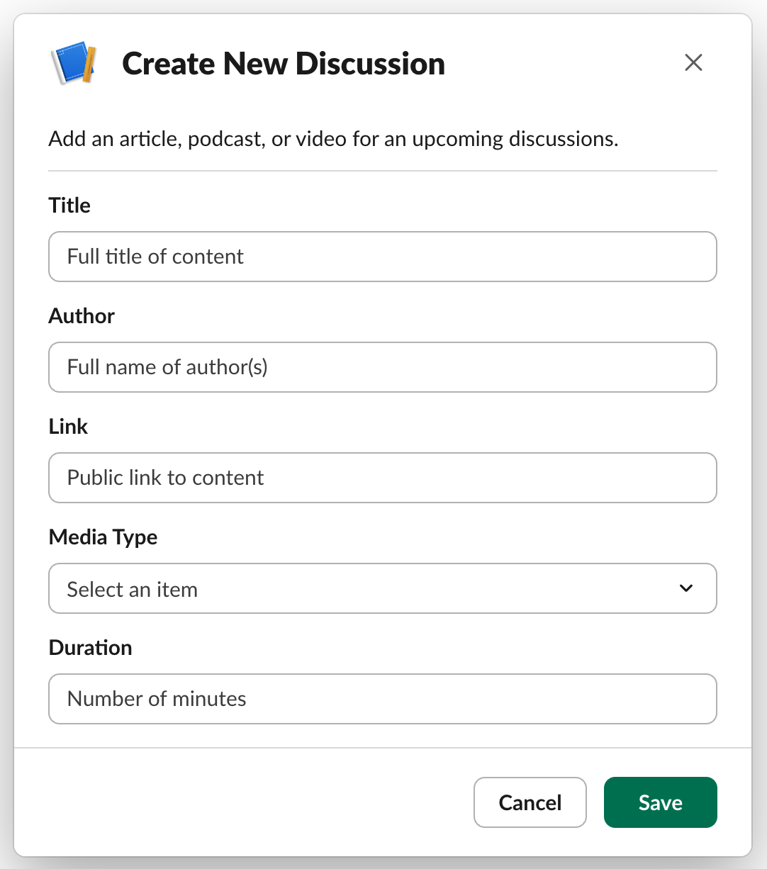
Rendering this modal required the following Block Kit payload to be generated:
{
  "type": "modal",
  "title": {
    "type": "plain_text",
    "text": "Create New Discussion"
  },
  "blocks": [
    {
      "type": "section",
      "text": {
        "type": "plain_text",
        "text": "Add an article, podcast, or video for an upcoming discussions.",
        "emoji": true
      }
    },
    {
      "type": "divider"
    },
    {
      "type": "input",
      "label": {
        "type": "plain_text",
        "text": "Title",
        "emoji": true
      },
      "element": {
        "type": "plain_text_input",
        "multiline": false,
        "placeholder": {
          "type": "plain_text",
          "text": "Full title of content",
          "emoji": true
        }
      }
    },
    <=== 76 LINES REMOVED ===>
    {
      "type": "input",
      "label": {
        "type": "plain_text",
        "text": "Duration",
        "emoji": true
      },
      "element": {
        "type": "plain_text_input",
        "multiline": false,
        "placeholder": {
          "type": "plain_text",
          "text": "Number of minutes",
          "emoji": true
        }
      }
    }
  ],
  "close": {
    "type": "plain_text",
    "text": "Cancel"
  },
  "submit": {
    "type": "plain_text",
    "text": "Save"
  },
  "callback_id": "discussion_create",
  "private_metadata": { "source_channel_id": "C0573NGLYBU" }
}
As a result, we ended up with large JSON payloads scattered throughout the business logic that powered this prototype. In a production-ready implementation we would need to find a cleaner way to support the serialization of these payloads, extracting them more clearly from the logic that manages the internal workings of the application.
Overall developing this prototype was a really fun exercise. We learned a lot in the process and hope that thoughts and tips we've shared here and in the previous post prove helpful.
Are you working on a Slack app or considering it? If so, we'd love to hear more about the project you have in mind or questions/issues you've encountered working in the Slack ecosystem. Drop us a note in the comments below and thanks for reading.